
We encourage you to push creative boundaries this year, but with one caveat: logos are made to last. Whether you work with a designer or create your logo, be sure to design something that represents your brand identity and can withstand time to evolve with your business.
So, without further ado, here are the top logo design trends to look out for in 2022.
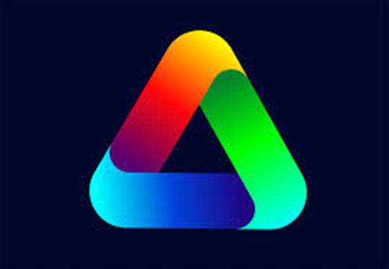
1- GRADIENT
A gradient is a design feature that is created when colours gradually fade into each other. Gradients can range from monochromatic schemes to many colours or shades blending. Regardless of which colours you use, a good gradient design needs to appear cohesive and fluid. Integrating gradients into your logo can add depth and dimension, and is sort of the antithesis to flat logo design (which is still trendy this year, too).
Incorporating your brand colours into a gradient is a simple and effective way to subtly enhance your logo. Remember, the key to good logo design is that it has to look good at any size, in any location. This can sometimes be tricky when using gradients, so if you’re going to try this trend, be sure to use it in a balanced way.
For example, if you use a gradient, apply it minimally, and only to part of your overall design. Consider using a gradient icon paired with a clean, basic geometric typeface to create a harmonious juxtaposition.
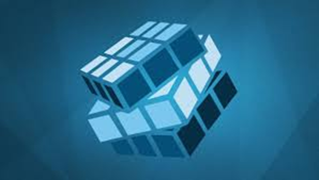
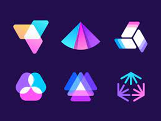
2- 3D DESIGN
To master this logo trend in 2022, 3D logos are taking on a new, refined identity. The use of bevelled edges, subtle blurring, reflections and gradients can minimally and meaningfully update your logo. Plus, it’s a clever and eye-catching way to get your audience’s attention by creating depth and perspective. To ensure your 3D logo appears modern and fresh—keep it light, minimal and consider adding it as only a part of the overall design.
As is with any trend, 3D logos may not be for everyone. Consider your industry, your brand identity and the overall message you want to convey. Depending on your specific business needs, you’ll know if 3D logos can work for you. For example, if most of your branding collateral is online, 3D logos can pop off the screen and add some personality to your online presence. However, if your logo predominantly appears in printed marketing materials or branded merchandise, the three-dimensional details can get lost or even detract from the design.
3- ANIMATION
Animation serves as a tool for storytelling, presenting a unique opportunity to provide context and liveness to an otherwise static design. It also allows for total originality, which can give your brand a creative edge over competitors.
Since the complexity of animation can range from simple moves to a complete video, be sure to consider your overall business goals and how an animated logo asset can work within your brand strategy. Furthermore, consider your audience. The digital space is noisy and saturated, and their time is valuable—you’ve only got a few seconds to hook them.
To make the most out of this logo trend in 2022, authenticity is key. Keep your brand identity front and centre to ensure your animated logo speaks the same language as your other branding assets. Subtly is an art form, and there’s a fine balance between what’s creative and engaging versus what’s distracting and annoying.
Animated logos can only be presented online, so let them live their best life on your social channels, website, presentations and promo videos.
4- MONOCHROMATIC COLOUR SCHEMES
Monochromatic means that you’ll only use one colour when you design your logo. This may sound simple or boring, but it’s quite the opposite. Creating a refined palette that integrates various tints and tones of a specific shade is a sophisticated way to add texture and depth.
Colours matter, and when you only use one, it carries a lot of weight. So, if you opt for a monochromatic design, be mindful of the associations and feelings linked to each hue and choose wisely:
Colour trends in 2022 are bright, earthy and warm. We’re seeing everything from grey-green and icy blue to chrome and traffic-cone orange. Muted tans and soothing warm neutrals also continue to gain momentum as a trend for the year. While it may be tempting to test out these fashion-forward colours, remember to stay true to your brand identity and stick with hues that holistically communicate your message.
5- LAYERED LOOKS
Layering is a visual technique that adds richness and depth to your logo. Cleverly designed layers direct the eye, putting part of the design in the foreground, while intentionally leaving other elements in the background.
In 2022, we’ll see layered letter logos, transparent effects and new contours. Layering must be deliberate to enhance the overall logo design rather than clutter it. There’s no use in haphazardly throwing elements together without considering the visual implications and the brand message it sends.
Layers offer the flexibility to mix and separate complex design elements. To use this logo trend effectively, think about each element individually and as a part of the complete package. Playing around with thickness and thinness, textures, colours and spacing can create unexpected and unique layouts.
CONCLUSION
As we head into 2022, we’re all a little wiser, and ready to move forward with a fresh attitude and a new perspective. So, whether you’re starting a new business or giving your brand a revamp, remember that your logo is the mighty face of your brand and the most recognizable part of your business.
Palak Lalwani